-
-
Yeah I was laughing about these unis this morning. The colors actually look ok but the numbers and huge helmet logos kill it completely.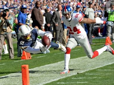
-
Blech.Comment
-
The uniforms that bothered me most in the past were the old florescent Buccaneers and Broncos uniforms. They were too blinding. Glad they are gone. The Dolphins are still a little too bright, but I can deal with it, especially now that I don't go to games.
The current uniforms that kind of bother me are the Seahawks and Eagles. They look way too similar. One of them should come up with something that isn't too much like the other.
I guess what I'm saying is, as long as the unis don't reflect an overabundance of sunlight and they don't look like some other team, I don't give a shit about them.Comment
-
The numbers kill the whole thing. Like the artical said, they look like an 80s analog watch.Comment
-
I'm sure John and AG Spanos think they are kewlForget it Donny you're out of your element
Shut the fuck up DonnyComment
-
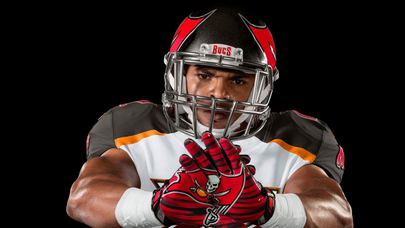
Ugliest Uniforms EverComment
-
lol

Comment
-

Comment
-
I think they are quite possibly the ugliest unis in the NFL, which is saying something with the Bengals out there.Comment
-
X F L, U S F L, A R E N A , U G L Y are just a few letters that come to mind.Comment
-
I know I'm in the minority, but I liked the creamsicle unis. They were distinctive and had flair.Originally posted by thelightningwill View PostAdiposeComment
- If this is your first visit, be sure to check out the FAQ by clicking the link above. This is an entirely free site so all we ask is that you create a membership in order to view messages and post. Register here to proceed. And welcome to The Powder Blues community of Charger Fans. We look forward to building this community together. Go Chargers.
 Tweet
Tweet
Comment