-
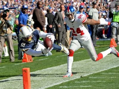
Go Rivers! -
More shots here.
Why do they always get the boltz backward???Go Rivers! -
Wait...the way your post read, it was like something in the works but just not yet approved. After reading the article it became clear that it's just some guy designing unis for fun.
I like em overall. But the shoulder bolts and the helmets are non -starters for me. You have to have a blue outline of the bolts on the helmet (or you go the blue helmet route) and you dont fuck with the shoulder bolts. That's inviolable. They need to wrap all the way around and they dont nee to be upside down. Fuck that. Anything else, I'm open to.Last edited by ArtistFormerlyKnownAsBKR; 03-05-2014, 03:50 PM.Comment
-
And the blue jersey with white helmet and pants ends up kind of looking like the Colts.Comment
-
The Bucs uniform concept this guy did is far and beyond better than the new real ones, lol. I like the Chargers one also but mostly because the bolts are placed over the shoulders the way they should always be.
Comment
-
This is nothing but some graphic artist geek putting modern (yet eerily similar as every other team) spin on what he/she thinks NFL uniforms should look like.
Stupid and dumb, yet surprisingly ugly.Comment
-
They need to just go ahead and bring back the throwback powder blues.Comment
-
Yet an upgrade from the horrible unis we have nowOriginally posted by TBF View PostForget it Donny you're out of your element
Shut the fuck up DonnyComment
-
The shoulder stripes are way better on that one.Comment
-
I'm sure that Nike maybe working on an update on the uniform, so unless I hear something official, not some fashion designer's idea of what they may look like, I'm not yet concerned. To me, simple is better, and the best continue to be the uniforms from the 60's.Comment
-
Time to fear this NikesDean Spanos Should Get Ass Cancer Of The Ass!
sigpicComment
-
- If this is your first visit, be sure to check out the FAQ by clicking the link above. This is an entirely free site so all we ask is that you create a membership in order to view messages and post. Register here to proceed. And welcome to The Powder Blues community of Charger Fans. We look forward to building this community together. Go Chargers.
 Tweet
Tweet

Comment