OT: Redsigned Logos for Every Team

Collapse
X
Collapse
First Prev Next Last
 
  • Filter
  • Time
  • Show
Clear All
new posts
  • TTK
    EX-Charger Fan
    • Jun 2013
    • 3508
    • America's Finest City
    • Send PM

    OT: Redsigned Logos for Every Team

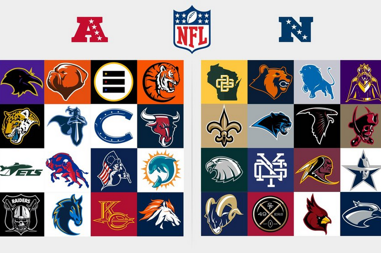
    (full logos are on the linked site)

    http://bleacherreport.com/articles/1779000-redesigned-logos-for-every-nfl-team?utm_source=cnn.com&utm_medium=referral&utm_ca mpaign=editorial&hpt=hp_t3


    Designer Max O'Brien put in the time and effort to redesign every NFL team logo, and it's as awesome as it sounds. This is just a passion project for O'Brien to celebrate the return of football. Teams are not considering them as replacements... yet. Let us know what you think of the redesigned logos in the comments!


  • ArtistFormerlyKnownAsBKR
    Registered Charger Fan
    • Jun 2013
    • 7310
    • Send PM

    #2
    Really like Packers, Bears, Bucs and Niners. Chiefs is improved. Dallas is ludicrous, as are the Raiders and Vikings. Bengals is like a cross between a bengal tiger and a grub worm. Steelers a step backwards

    I like the idea of going back to the horse but it needs the shield. Dont really dig ours too much.

    Comment

    • bonehead
      Undrafted
      • Jul 2013
      • 5209
      • TBD
      • Retired
      • Send PM

      #3
      Boy between this guy and the Spanos "design team" our uni's will suck forever.
      Forget it Donny you're out of your element

      Shut the fuck up Donny

      Comment

      • sandiego17
        Registered Charger Fan
        • Jun 2013
        • 4319
        • Send PM

        #4
        Ours looks like a seahorse to me, not a fan. Bengals is the worst of the lot.

        Comment

        • Panama
          パナマ
          • Aug 2013
          • 5335
          • London
          • Opera singer and web developer.
          • Send PM

          #5
          Some of them are very good; others are laughably bad. I think the Patriots ought to consider adopting this one.
          Adipose

          Comment

          • 6025
            fender57
            • Jun 2013
            • 9786
            • Send PM

            #6
            These pretty much suck across the board. Have every team return to their 1969 uniforms and call it a day.

            Comment

            • QSmokey
              Guardedly Optimistic
              • Jun 2013
              • 5706
              • Kuna, Idaho
              • Retired
              • Send PM

              #7
              My observations:

              - Bengals stood out like a sore thumb. A "snake" Tiger. Ridiculous!
              - I like the Chargers, but it's too plain. Agree w/BKR that the shield needs to be there
              - Kansas City looks like "KG"
              - The 49ers looks like "Not 49ers"
              - The Raiders looks babyish
              - Who cut the poor Seahawks' nose off?
              - The New York Giants looks like one of those multi-piece brain teaser puzzles
              - The Cowboys creeps me out
              - The Steelers looks like a bar code

              Comment

              • Fleet
                TPB Founder
                • Jun 2013
                • 14162
                • Cardiff - Poipu
                • Send PM

                #8
                Must be a Brokeback Bronco.

                Comment

                • TABF
                  Por debajo del promedio
                  • Jun 2013
                  • 2627
                  • SoCal
                  • Send PM

                  #9
                  USFL ish... Saints didn't change. Our image looks hidious.

                  Comment

                  • Antonio's Gates
                    Registered Charger Fan
                    • Jun 2013
                    • 2436
                    • Send PM

                    #10
                    patriots and browns should use the ones here as their official logos.

                    Comment

                    • TTK
                      EX-Charger Fan
                      • Jun 2013
                      • 3508
                      • America's Finest City
                      • Send PM

                      #11
                      I like the Redskins logo in the shape of an "R" but who knows how long they'll be the Redskins these days...

                      Chargers logo is terrible but I actually like the rest of the AFC West ones.

                      Comment

                      • Fleet
                        TPB Founder
                        • Jun 2013
                        • 14162
                        • Cardiff - Poipu
                        • Send PM

                        #12
                        Is the Bronco horse supposed to also be a Mountain on fire? With all the fires there thats what i see. A snow covered mountain with fire on top.

                        Comment

                        Working...
                        X