 Tweet
Tweet
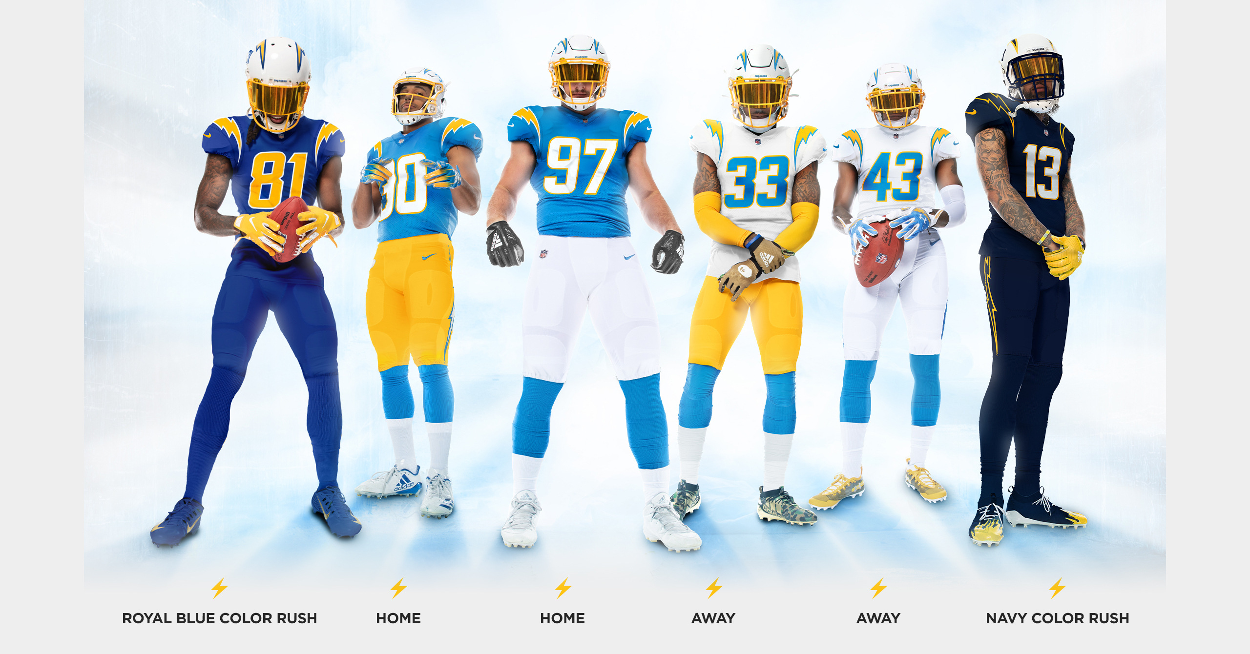
Somebody, much smarter than myself, which I am well aware is 99.2% of you, needs to do a poll as which is your favorite.
-
-
The only one I don't care for is the white with yellow pants. Favorites are all whites, and super dark blue on the far right.Originally posted by MagicMamba88 View PostComment
-
Yeah gotta agree,love em all but the white top yellow bottoms dont quite jive.Comment
-
But that's Derwin...Originally posted by Boltgang74 View PostWe do not play modern football.Comment
-
Nuthin but love for DJ but the white n yellows aint it.Maybe powder blue bottoms woulda worked better.Comment
-
Home run.
Personal favorites: powder blue tops+yellow pants and all white aways.Comment
-
Really liking the white jersey and gold pants. Hec the only one i dont care for is the all Navy...the rest are home runs.
Had to be the right yellow and they nailed them.
Also can someone post a 60s powder blue jersey next to these? Im thinking they are slightly darker but hard to tell.Comment
-
Really like both the color rush! Looks like everyone was right. There's 4 jersey colors and 4 pants colors (simple), and they mix a few to make 2 more combos. Got rid of navy blue but made it into a color rush, which almost looks black.
Not saying you should, but you really can just about mix and match the jerseys and pants to create throwbacks. Royal blue jersey plus yellow pants. Navy blue jersey plus white pants. Royal blue jersey and white pants.
SPOILER
Comment
-
Very happy to see these changes. With these new uniforms, the Chargers will be the best looking team on the field week-in, week-out. Let's hope winning comes along for the ride.
Some additional thoughts and comments:
TV Numbers- Why have them when they are already on the helmet? Thumbs up from me for removing the TV numbers from the shoulders and sleeves.
- While nostalgic for the numbers on the sleeves, they never looked right on certain players whenever the fabric got bunched up.
- Never liked the upside-down bolt on the 2007-2019. Oversizing the bolts left little space on shoulders and sleeves. Removing them visually simplifies the design. This is a case of addition through subtraction.
- In general, I'm not a fan of mono-colored uniforms, but the Navy and Royal Blue Color Rush uniforms are not bad and much better than other teams offerings.
- I wouldn't mind seeing matching yellow and white pants with the royal blue and navy tops.
- Numbers on the sides of the helmets give the Chargers a unique look among other teams, much like the Steelers logo on just one side of the helmet.
- Very nice. One nitpick would be the size of the white/yellow stroke. I'd make this a little thicker so that it distinguishes the bolt and numbers better against the jersey color.
- Again, addition by subtraction. One look at these uniforms, and you should know what team this is (2015-2019 Browns, I'm talking to you).
- Plus, I can imagine that the Chargers are still in San Diego, since it doesn't say LAC like the new Falcons uniforms.
- Very happy that there are Sunshine Gold pants to go alongside the white ones. I never got to see these in-person, but I always liked the look of the 1961-1964 Chargers.
Comment
-
Sweet the first domino in my pipe dream has fallen. Now Simmons and OT or two OT would finish Christmas in April. Only thing better would have been powder blue helmets, but I digress, love these uniforms.Comment
-
Looks like a cross between the St. Louis/LA Rams of old with a bit of Miami Dolphins thrown in for bad measure.Comment
-
The new uniforms are awesome... Ready to put in my order for a Home Jersey with Tua, Simmons or CeeDee on it
Comment

Comment